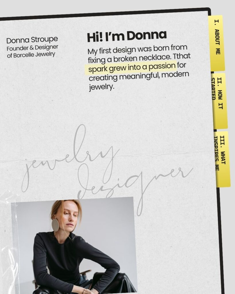
Trust rarely begins with a long explanation. More often, it begins with a quick impression. Within a few seconds of arriving on a website or encountering a brand for the first time, people form an initial judgment about its credibility.
They may not consciously analyze what they see, but subtle visual cues begin shaping their perception immediately. The spacing between elements, the rhythm of typography, the quality of images, and the overall sense of order all communicate something before a single sentence is fully read.
This is why visual details matter so much in branding. Long before people decide whether they trust a brand, they decide whether it feels trustworthy.
Before people believe what your brand says, they notice how carefully it presents itself.
The Role of First Impressions
In digital environments, attention moves quickly. Visitors scan rather than read, looking for signals that tell them whether a brand feels credible, professional, and relevant to them.
These signals are rarely obvious. They exist in small details that collectively create a sense of quality.
When a website feels balanced and calm, users tend to assume the brand behind it is thoughtful and reliable. When the experience feels cluttered, inconsistent, or poorly structured, the opposite perception emerges just as quickly.
The difference often lies not in major design decisions but in the precision of smaller ones.
Typography Sets the Tone
Typography is one of the first elements people encounter when interacting with a brand online. The way text appears on a page communicates more than the words themselves.
A carefully chosen typeface can signal confidence, clarity, and professionalism. Poorly matched fonts or inconsistent text styles, on the other hand, can make a brand feel unpolished even if the message itself is strong.
The hierarchy of typography also plays an important role. Clear distinctions between headlines, subheadings, and body text help readers navigate information effortlessly. When hierarchy is unclear, the experience becomes mentally exhausting, and trust begins to erode.
Good typography rarely draws attention to itself. Instead, it quietly supports the reading experience and allows the message to feel structured and intentional.
Spacing Communicates Confidence
Another visual detail people notice immediately—often without realizing it—is spacing.
Brands that feel trustworthy tend to use space generously and consistently. Elements are aligned, margins are balanced, and sections are clearly separated from one another. This sense of order creates a calm environment where information feels easy to process.
When spacing is inconsistent or overly crowded, the experience becomes visually stressful. Even if the content itself is valuable, the presentation suggests a lack of care.
Space communicates confidence. It signals that the brand understands what is essential and is comfortable allowing its message to stand on its own.
Image Quality and Consistency
Images often form the emotional layer of a brand’s presentation. Photography and visual assets help establish mood, personality, and atmosphere.
However, inconsistency in imagery can quickly weaken a brand’s credibility. When images vary dramatically in style, color treatment, or quality, the brand begins to feel fragmented.
Trust builds more easily when visual assets share a recognizable language. Similar lighting, composition, and editing styles create a cohesive experience that feels intentional rather than improvised.
Consistency in imagery suggests that the brand pays attention to details and understands how it wants to be perceived.
Alignment and Structure
Even subtle alignment issues can influence how people perceive a brand. When elements appear slightly misaligned or inconsistently spaced, the overall composition begins to feel unstable.
These small inconsistencies may seem insignificant on their own, but they accumulate into a larger impression of disorder.
Strong brands tend to rely on clear structural systems. Grids guide layouts, margins remain consistent, and elements align in predictable ways. This structural discipline creates visual harmony that readers experience as professionalism and reliability.
Trust Begins With Care
Trust is often described as an emotional response, but it is influenced by surprisingly practical details. The way a brand organizes its visuals reveals how much care has gone into its presentation.
Visitors rarely articulate these observations consciously. They simply feel whether the brand appears thoughtful or careless, refined or improvised.
Visual precision communicates attention. Attention suggests intention. And intention is one of the earliest signals of trust.
In this sense, the smallest details of design carry a larger responsibility. They shape the moment when a visitor decides whether the brand in front of them deserves a closer look.